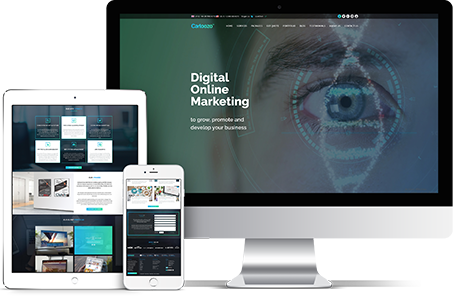


It comes as no surprise that the internet is updating. Users across the world access internet in a great number of ways. Hence, it is no surprise that they use their smart phones for this. Therefore, it is essential for business owners to transform their websites into mobile friendly websites and optimise them in order to improve the overall experience of users.
“Mobile-friendly websites provide a better user experience”.
“Google introduced mobile-friendliness as a ranking factor for search engines on April 21, 2015.”
Here are a few tips to optimise your mobile–friendly websites:
Configuration
According to Webmaster’s Guidelines, there are mainly three types of mobile site configurations:
- Responsive Web Design
- Dynamic Serving
- Separate URLs
The most popular being responsive web design because it renders display according to the screen size.
Facts:
- Responsive design is a Google’s recommended design.
- Responsive web design (RWD) is a setup where the server always sends the same HTML code to all devices.
- Responsive design ensures a quality user experience.
Tips:
- Understand the features of different devices (tablets, mobile, Multimedia phones, etc.)
- Choose responsive design because it requires less engineering time and requires no redirection.
Content
Organising your content is critical. Hence, keep your content precise but complete in terms of information.
Tips:
- Keep your content short.
- Write concise and readable paragraphs.
- Choose a simple layout.
- Never forget to add call-to-actions (CTA).
- Replace plain lengthy text with bullets.
Font
You should adjust your font size according to the devices. Use standard fonts that are easily readable. For better readability, keep your font size consistent across the site.
Tips:
- Never use clumsy fonts.
- Pay attention to font sizes and types.
Interactive elements (CTAs, banners, ads, etc.)
Always understand different devices before using interactive elements. Use CTA icons rather than tiny links. Understand the guidelines and adjust your interactive elements accordingly.
Tips:
- Include large icons.
- Incorporate standard gestures, such as double-tapping.
- Avoid using flash elements across the website.
- Avoid using heavy codes.
Site navigation
Always keep your site’s navigation simple and intuitive. You also need to remove unwanted text as well as icons to get rid of the clutter. For better usability, simplify your navigation bar and drop down menus.
Visual content
Use high quality visual elements, such as videos, infographics, images, and other visual art. For better visibility and interaction, replace lengthy text with suitable images. You also need to optimise these images and videos.
Clickable phone number
According to a study, 70% of mobile searchers use “The Call Button” in order to get in touch. So, use click to call feature. You also need to optimise page load speed to improve the overall experience of users.
Statistics:
- If a mobile website takes longer than 3 seconds to load, 43% of your visitors never return.
- 83% of the #1 search results are mobile-friendly.
- 77% of search results on page one are mobile-friendly.
- 90 percent of consumer’s mobile time is spent on apps.
According to Aberdeen Group, “A 1-second delay in load time can mean 11% less page views, a 16% decrease in customer satisfaction, and 7% loss in conversions”.
So, in order to improve the mobile experience of users, you need to optimise it.